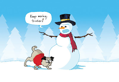
Today I thought I'd go through the steps of how I created the illustration for our company Christmas card. My boss has a bit of a twisted sense of humor that he only occasionally makes known. Two years ago, we sent out a card that depicted a dog who had just marked his territory on a snowman. My boss LOVED it. So much that last year, he insisted we continue this theme with a cartoon illustration:
This year, I drew up a few designs for the new card. Since it is a corporate card and we can't make any references to religious holidays, Snowmen make good, reliable secular characters. Here, the snowman is using his carrot nose to get the dog to pull his sled:
Unfortunately, one of our biggest competitors uses the dangling carrot motif in all their marketing. I was asked to change the image:

As you can see, we completely lost the joke here. I decided to add some more flair to the illustration and eventually salvaged it by incorporating the whole scene (detail below):

Notice the mysterious yellow mark behind the snowman. The inside joke continues.
I made a few other images that remained unused, but I still felt had some merit.


Salt melts snow, you know.

I love this one... the look on the guy's face on top of the mountain kills me, I don't know why. He's so oblivious and satisfied with himself.


No comments:
Post a Comment