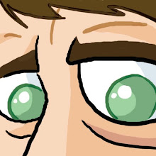
Here's a doodle I did today just for the heck of it:

I tried to keep it loose but still keep the basic feel of the characters. The lines are a little squiggly because I was using my pen tablet, which I am still getting the hang of, and trying to be conscious of the hierarchy of thick and thin lines. Came out ok, for being a quick sketch... I guess Barney's hand looks a little weird...
Like most people, I always liked the Flintstones, but I did have problems with it. The Hanna-Barbera limited animation style of all those Cartoon Express cartoons always looked cheap to me, even as a kid, and the flat drawing style bored me. The humor was also pretty thin... how many times did they use that same punchline when an animal is being used as a household appliance: "Eh, it's a living!" It also always bugged me that the characters would run with their arms hanging still at their sides.
More recently, though, I came to appreciate what HB was doing in those early days of made-for-TV cartoons. The drawings were more flat than their earlier theatrical shorts (like Tom & Jerry), but they were very graphical and stylish... an extension of the UPA style. The art was very carefully thought out by top designers like Ed Benedict and Carlo Vinci.


The backgrounds above are very stylish and well-designed as well. They retain the style of the character drawings but stand back because of the textures, and the limited color palette. I don't do a lot of painting (almost none actually) but I've been trying to incorporate this look into some of my drawings using Photoshop brushes. I may try out Corel Painter one of these days... can anyone recommend it?
This stylishness can sometimes be lost in the way these characters are depicted now... Sometimes you'll see them rendered with three dimensional shading, which makes absolutely NO sense with the way they were designed. Certainly not in this style, anyway:

They work so much better flat and grapical. The above just looks like a lousy Disney cartoon. In the '90s they even made a live-action movie. I guess it's interesting for about five minutes to see what they'd look like as real people, but when you stop and think about it the whole endeavor is kind of stupid, isn't it? I don't get why studios do this... if you want to make a Flintstones movie, why not a cartoon? It's the medium the whole concept was created around. Fred's outfit makes no sense on a real human body.
Everything has its place. These HB cartoons can be sort of boring to watch but there is genuine skill in the way they were executed that I am just now beginning to pick up on.
Here's a couple funny clips, including Fred and Barney hawking cigarettes in the 60's: